Most people prefer to use a neutral colored carpet in their home to allow their taste in furniture and color palettes be a main focus. The use of colored carpeting can severely limit the shades and hues of wood grains, for example, and narrow your range of color options when decorating.
But what happens when you move into a space that already includes colored carpeting, such as a rental, or home that requires time and patience before a new carpet can be installed?
Or, maybe you just REALLY want blue carpeting!
No matter the reason, blue carpeting is surprisingly easy to match and has many more decorating options available to you than you might have initially thought. Take a look at these great ideas!
Decorating Rooms with Blue Carpeting
Blue is a cool color, often associated with sadness, but rather than stimulating feelings of depression – it actually promotes feelings of calmness and serenity.
It also is associated with intuition, inspiration, trust, and confidence, and is often used in office spaces and classrooms to help create a space associated with the wide open outdoors, and to instill peace in those within.
Blues naturally work well with neutrals and light, warm hues to create spaces that feel open and free. And, as a floor covering, it serves as a nice way to create a framing of the rest of the room – offering a contrast to all you place upon it.
Using the correct shades of blue carpeting, and colors to mix and match, you can create your own peaceful oasis. Take a look at these steps to help you create your space from the ground up.
You might be interested: 30 of the Best Blue Bedrooms
Step 1: Choose a Carpeting Shade
The color blue you choose for your carpeting doesn’t matter as long as you love it, but you want to consider a few pointers going in. You might also not have a choice if carpeting was already laid, but these tips still apply to you:
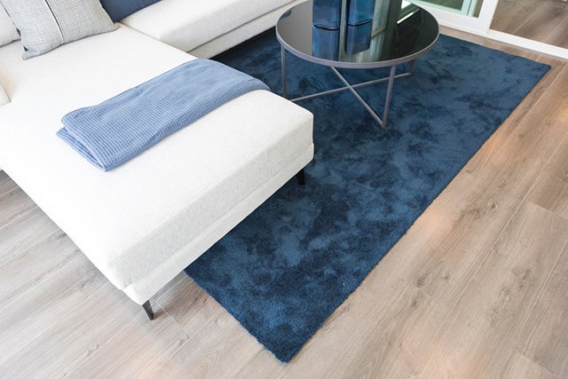
Dark colors should be reserved for smaller rooms. Although this sounds the opposite of what it should be, smaller rooms will have less floor space, emphasizing the furniture and decor choices you make. Think of your darker carpet as a way to force the eye towards the lighter hues in the room.
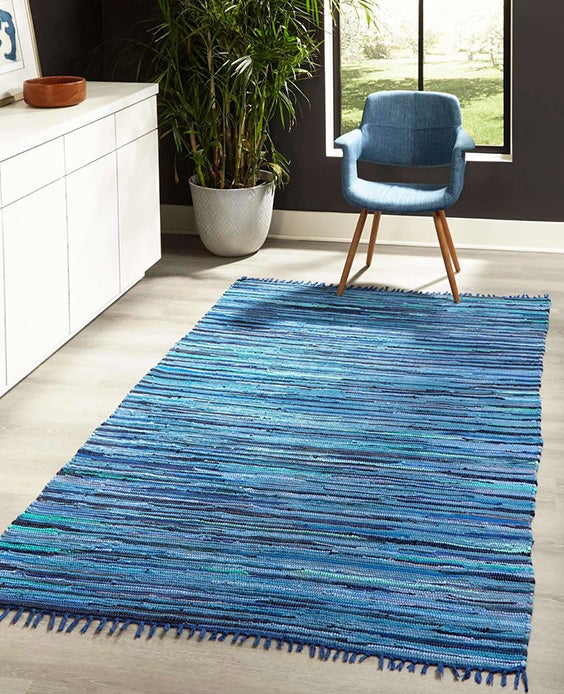
Light colored carpeting works well in all spaces, especially large rooms. It works to highlight and/or complement your furniture and decor choices. It also helps make your larger rooms look even bigger.
If you don’t have a choice, be sure to avoid dark colored decors when you have a darker hued carpet to avoid a cluttered looking area.
Step 2: Choose a Wall Color
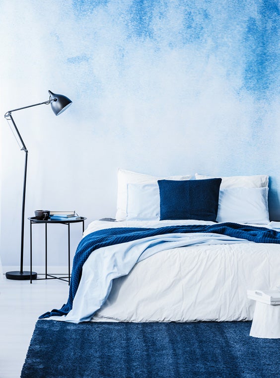
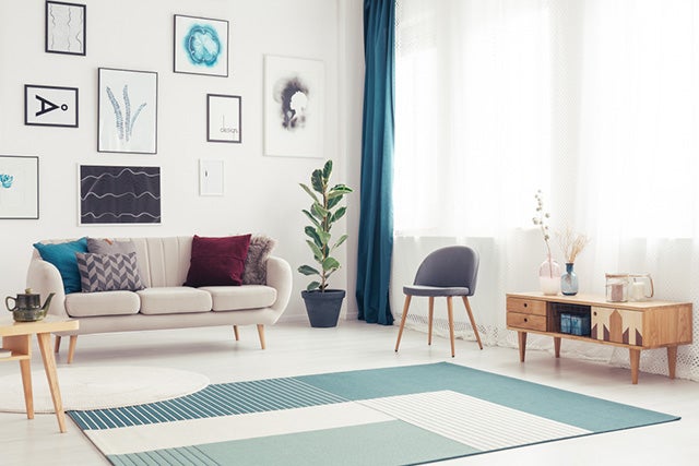
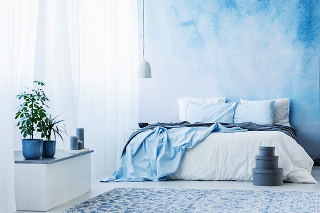
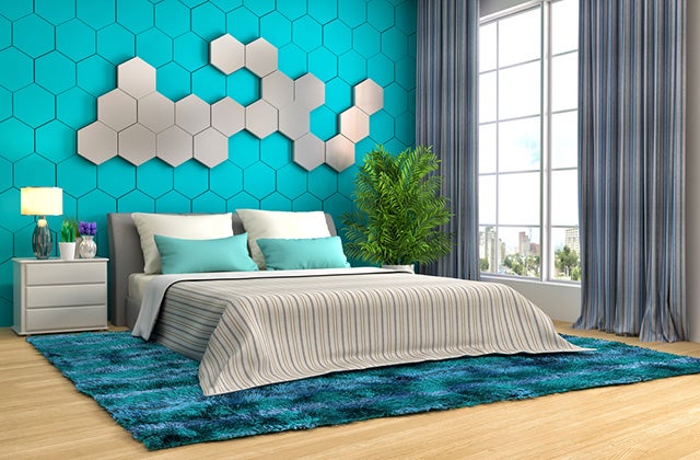
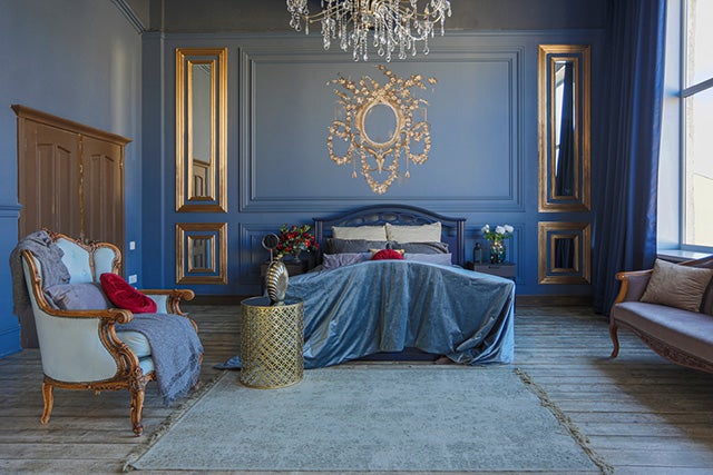
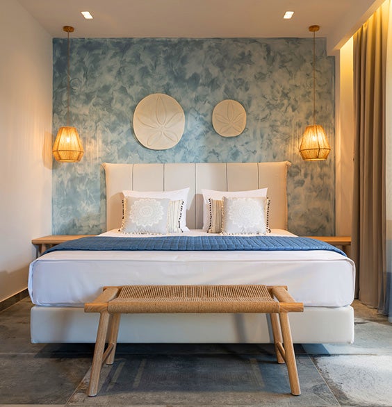
When you have a colored carpet, it is best to use neutral colors on your walls. White variations, creams, or even light tans are best to stick to. A highlight wall of a darker neutral shade or even darker blue is also acceptable to create depth, but stick to only one or two conjoining walls if you choose to go this route.
Avoid wallpaper if you have blue carpeting, or if you simply can’t live without it, stick to a highlight wall with white or very light neutral paint on the other walls. Make sure the wallpaper isn’t busy and use a simple pattern such as strips on a white background.
You might also consider an oversized accent pattern on an accent wall – such as oversized flowers or design. This can be painted on or created via a decal. Consider using blues lighter than the carpeting to create a monochromatic look (explained below).
Step 3: Choose Drapery
Long drapes should always be reserved for larger, open spaces, while short, framing window dressings work best in smaller rooms. Like your walls, you should stick to neutral colors or those colors you are using to create contrast with (explained below).
Simple patterns or stripes are acceptable as well as long as they are not overwhelming and match the rest of the decor. Be sure to pick an option that works with both the walls and the floor covering.
Step 4: Matching Wood Tones
White or neutral furniture is a good choice, but light-grained woods are the best. The variances of wood grains and the lighter stains help bring out the blue in the carpet. Look for beds, side table, and chairs that have wide panels to help show it off.
If natural woods aren’t your thing, consider wicker in natural or white.
Just avoid dark woods and dark stains.
Step 5: Considering Themes
Themes can be simple and contain patterns of stripes, florals, or chevrons. Or it could be very specific, such as nautical, beachy, or country.
When working with themes, remember less is best. You can use patterns in sheets, throw pillows, drapery, or wall decor. Detailed themes are best brought out through accessories and wall art rather than using heavy patterns.
Natural materials such as jute, sea grass, and natural woods or wicker work really well with certain themes as well.
You might want to read this: Sleeping in a Room with New Carpet
Step 6: Picking Out Decor
Decor is defined as the whole of your decorating style. The colors, patterns, and themes you decide upon are all a part of this. Consider these suggestions.
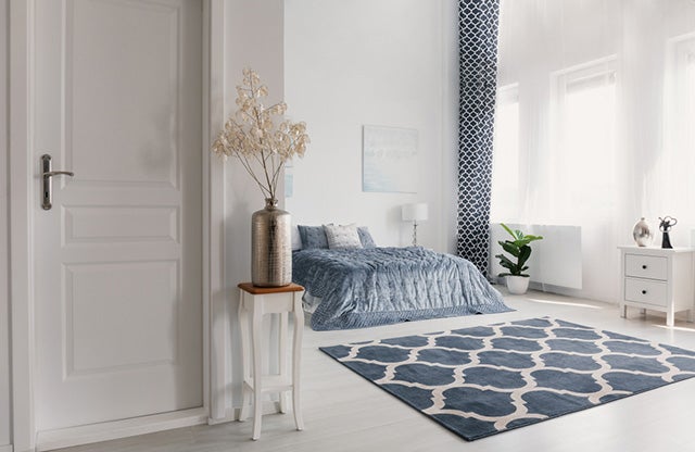
Neutrals
When using neutral tones, don’t be afraid to use varying hues. Whites, grays, beige, and taupe all come in varying degrees of light and dark tones and can be mixed and matched to help balance the effects of a blue carpet.
Don’t be afraid to add in touches of blue with your neutrals to help blend the colors together and keep it from looking bland.
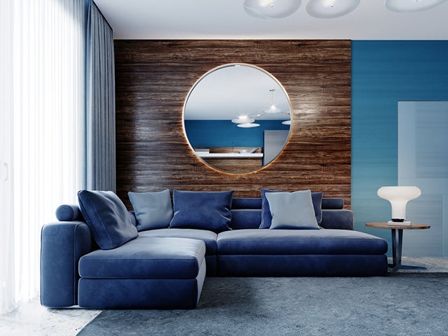
Monochromatic Tones
Monochromatic decor means to use the same color throughout the decor. Using the wide range of tones and hues blue offers creates depth and interest. Mix with a basic neutral to help break up the blues and allow them to stand out on their own.
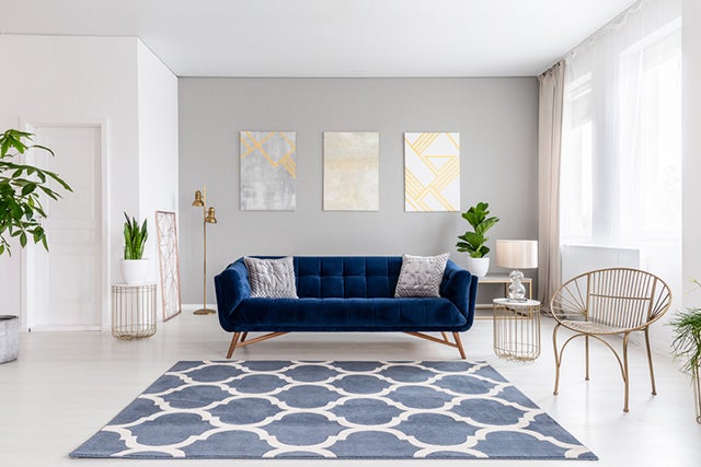
Contrasting Colors
Orange is directly across from blue on the color wheel as a contrasting color. You don’t have to use a bright orange, but a touch of peach in varying tones mixed with light neutrals and light blues are a great way to brighten a room and create highlight interests.
Step 7: Pick and Choose Accessories
When you decorate with collectibles and knick-knacks, you can take advantage of various blue tones as well as contrasting oranges against neutral backdrops to make them “pop.”
Follow the same advice provided in the steps above when it comes to your decorations. Feel free to mix in other colors as well, just don’t allow them to overwhelm the simplicity of the work you’ve done with the steps above.
You might want to check this out: Best Bedroom Rugs
Wrapping it Up
Blue carpeting doesn’t have to be something that makes you unhappy if it wasn’t your first choice. And if you wanted blue, now you have some excellent ideas to use it in a way that creates a comfortable and peaceful decor.
Blue is a calming color and the coolness of the tone allows you to bring in warm neutrals and orange based contrasts to add to your space. Don’t over darken your space with dark paints or buy wallpapers, although highlight walls can help add depth.
Photo credit: ben bryant/Shutterstock;
DesignStock09/Shutterstock; Interior Design/Shutterstock;
KUPRYNENKO ANDRII/Shutterstock; Ground Picture/Shutterstock;
George Tsamakdas/Shutterstock